Does your Google Analytics data show that 10,000 people visited your site, but only 30 purchased? Most people will spend around a minute or less on your website and leave without much action. Sometimes, it’s just the sporadic nature of surfing the internet. Other times, it could be because the product was too expensive or your content doesn’t meet their requirements. There are several reasons why people leave your website without purchasing: they didn’t find what they needed, they were simply window shopping, and so on.
The good news is you can generate more leads by employing an exit-intent popup. With this popup, you can enlist the visitors’ relevant contact details and direct them to another page. This gives you access to their inbox for future advertising. But what does an exit-intent popup look like and how can you create one of your own? In this post, you’ll find all the essential information. From a step-to-step guide to bonus exit-intent popup examples and tips, we’ve included it all.
What is an Exit-intent Popup?
How to Create a Website Exit-intent Popup?
- Step 1: Select a Template
- Step 2. Adjust the Text of Your Offer
- Step 3. Decide What Happens When Visitors Sign Up
- Step 4. Set up the Exit-intent Popup
Why Should I Set up an Exit-intent Popup?
5 Best Practices to Create Exit-intent Popups
- Make it Mobile-friendly
- Use A/B testing
- Track Conversions
- Provide an Easy Way to Close it
- Keep the Message Simple
What is an Exit-intent Popup?
An Exit-intent popup is a graphical display that appears as soon as a visitor leaves a website. When they exit the browser’s main viewport, the exit-intent popup is displayed. It is a part of a business’s marketing strategy that keeps visitors from leaving the website. With the implementation of the exit-intent popup, marketers can capture the users’ contact details. Thus, they get access to their inbox for future retargeting. As a result, new visitors can be converted into leads, subscribers, and even customers.

How to Create a Website Exit-intent Popup?
Creating an exit-intent popup for your website is effortless if you’ve already registered an account. Next up, simply connect Getsitecontrol to your website. Here’s a quick 4-step guide that you can follow:
Step 1: Select a Template
Before creating the popup, consider what type of CTA (Call To Action) you want to display on your website. Once you select a template that caters to your expectations, follow the prompts on the right-hand side. Add it straight to the Getsitecontrol dashboard.
Step 2. Adjust the Text of Your Offer
On the Getsitecontrol dashboard, you can exit your offer and CTA. Select the text you want to change. Then, start typing your copy. However, remember to keep the CTA crisp and precise. Also, if you’re offering free shipping or discount coupons, keep the terms clear.
Step 3. Decide What Happens When Visitors Sign Up
When the visitor is done filling out the form, show up a submission success statement. For instance, if you’re proposing a free shipping coupon code in exchange for an email, you have two alternatives. You can either display the code through the popup or send it via email. In case you want to send an automated email, use the Autoresponder feature. You do not need to install email marketing software to send an automated response.
Step 4. Set up the Exit-intent Popup
Now that you’ve set up the copy and design, it’s time to create the exit-intent popup. First of all, get a field named Start which you want to display the popup. Then, neglect/remove the default ‘at once’ tab. After that, hit + Add condition. Select ‘Exit Intent. Once you’ve saved and activated the popup, the visitors will see it while leaving your website. You always have the last decision, you may also choose whether or not you want to display the popup on all the pages or some of them from the site.
Why Should I Set up an Exit-intent Popup?
Exit-intent popups are currently one of the most widely used marketing tools on the globe. They enable you to recover more than 50 percent of the visitors that want to exit your website. Consequently, you can generate more leads and boost conversion rates. The most popular exit-intent trigger is a subscription popup followed by a lead magnet. This allows the user to add their email addresses in exchange for something lucrative (such as discounts, entertaining content, free ebooks, and so on). As a result, marketers gain access to their email handles, which they can later use for future advertising.
5 Best Practices to Create Exit-intent Popups

Here are the top 5 actionable tips that will help you create the best exit-intent popups:
Make it Mobile-friendly
More than 45 percent of users browse sites on their mobile phones. If your exit-intent popup isn’t mobile-friendly, it will be displayed incorrectly. As a result, you will lose leads due to poor user experience.
Use A/B testing
With the A/B technique, you can figure out what copy, images, and CTAs work for your exit-intent popup.
Track Conversions
Tracking conversions enable you to comprehend on which pages exit-intent triggers are bringing in the most responses. Bear in mind that your pop-ups need to have reasonable goals. Let’s say “transfer your 30 percent of visitors into your genuine subscribers,” otherwise tracking conversions won’t help you much.
Provide an Easy Way to Close it
When creating a popup, it’s essential to provide an easy way to close it. Sometimes, these pop-ups get frustrating. If the visitor isn’t interested in your offer, they should be able to close the popup effortlessly. Thus, it’s recommended you provide your visitors with a well-visible X to close the exit-intent popup. Also, do not camouflage or hide the “no” reply. Keep the text visible.
Keep the Message Simple
Keep the message in your exit-intent popup simple. Never overwhelm your visitors with loads of text your pop-up contains, try to make it as simple as your can. Nobody’s going to read that anyway. Hence, keep your message short and simple.

Conclusion
While surfing the web, nobody likes being interrupted. But what if they were to receive a lucrative offer that’s relevant and well-implemented? Exit-intent popups are the best way to generate leads and boost conversions. They help you keep a lot of potential customers from leaving your website. If you want to upscale your business, consider these practices. Create the best and most effective exit-intent popups that pique interest and capture new users.
FAQs
What is a Pop-up?
Pop-ups are online advertisements we see when we open any website.
What is a Exit-intent popup?
An Exit-intent popup is a graphical display that appears as soon as a visitor leaves a website.
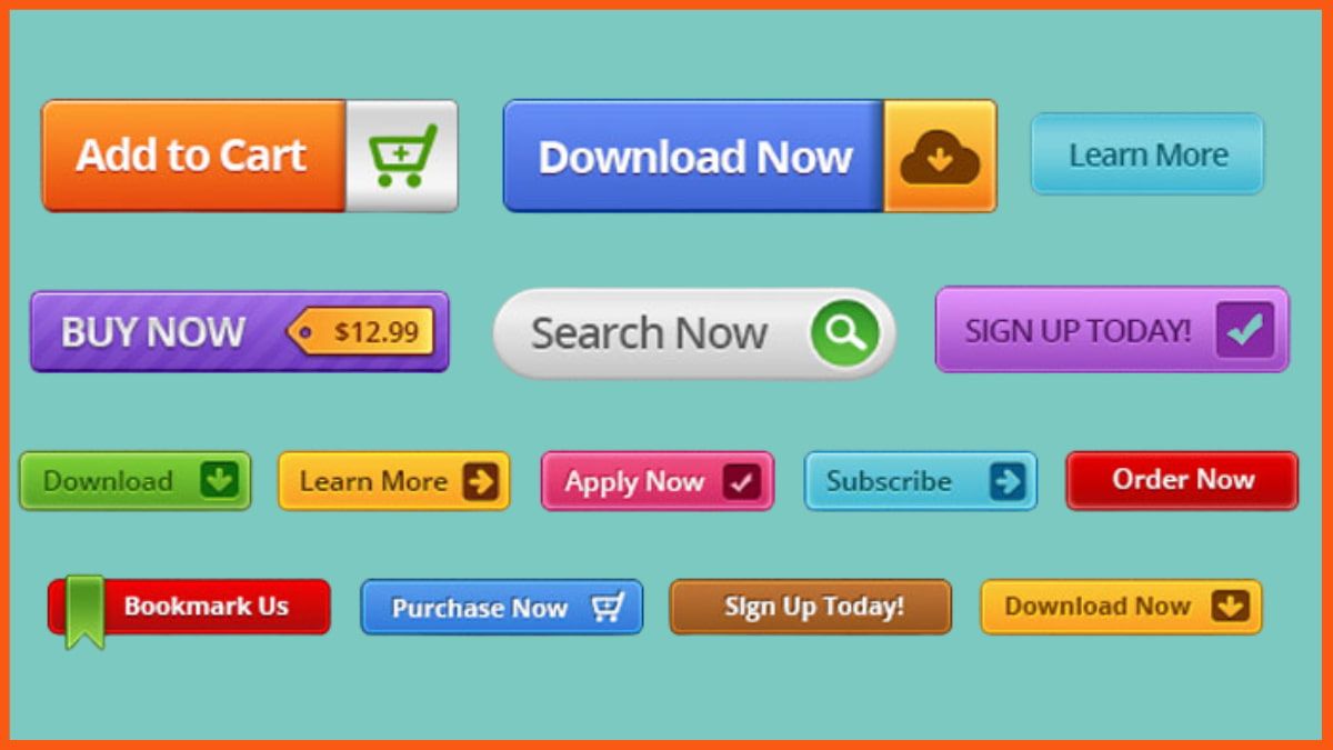
What is CTA button?
CTA button stands for Call To Action.